|
I am just going to post some quick comments and examples from
my own experience. This is by no means meant to be exhaustive,
and there are plenty of sites to review if you do a
Google search for "photographing miniatures".
Focal Length, Focus, In-plane
How you set up your lenses and how close you position your miniature
affects the depth of focus of your camera. A shallow depth of
focus causes the effect where a portion of the object is in focus,
but the rest is not, especially if you are focusing on the nearest
feature. The quick and dirty solution is to move the object farther
away (so you are sampling more of the object when focusing),
switch to a wide angle lens setup, and/or position the object
so that less of it projects into or out of the plane.
 |
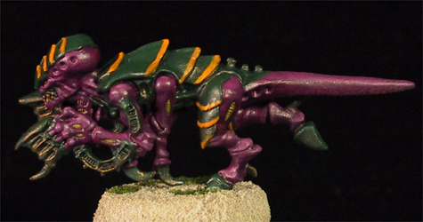 |
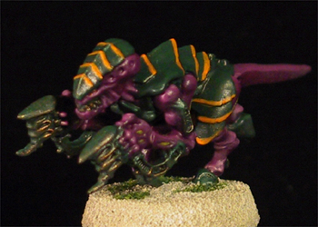
Both images were autofocused at the center
of the model. In the left image, the model is projecting
into and out of the plane more, so the ends of the model
are a little more blurry than the center point (in that
case, the left thigh). The right image, in contrast, is
mostly in-plane.
Canon Powershot G1, Auto setting, Macro on, maximum
telephoto, Flash off, 2 diffuse light sources from right
and left (24" away from model) and camera 12" from
model.
|
You may also be constrained in focal length. For example, in
the picture above, I used the maximum telephoto setting and the
macro lens feature. This setup required a minimum distance of
7.9" between the lens and the object. Any less, and it was
completely blurry.
Lighting
This is the most critical issue I deal with, it seems. The trick
is to diminish excessive glare due to finishes and achieve a
lighting effect such that the details and colors are as faithful
as possible to what one would see with the naked eye. There are
a couple of ways to achieve this.
First, you want to avoid glare - the bright spot of a bulb will
reflect off even matte-like finishes, depending on the setup.
The chief way to mitigate this is via a diffuser. For those of
us on the cheap, we can use a desk lamp with a paper towel
over it. PLEASE REALIZE THAT THIS CAN BE A FIRE HAZARD, DO NOT LEAVE
THIS UNATTENDED!
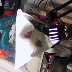 |
| Economy diffuser - cheapo swivel arm lamp with Chromalux
60W daylight
bulb and paper towel taped over opening. |
The angle and intensity
of illumination are important as well.
 |
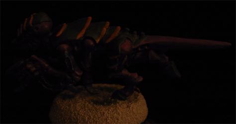 |
| Overhead illumination - 3 Reveal 60W bulbs
covered by slightly smoky glass. |
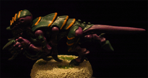
Zero overhead
illumination, minimal front bilateral
illumination - two swing arm lights out in front
to the right and left, rotated so the bulk of the light
does
not
shine on the model, Chromalux 60W bulbs. |
 |
 |
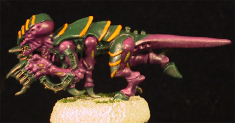
| Heavy front bilateral
illumination - Two
swing arm lights with Chromalux
60W bulbs out in front to right and left, bulbs pointed
directly at model, bulbs 36" from model. Although
details are somewhat visible, the shades of purple and
green are
far lighter than they look to the naked eye. |
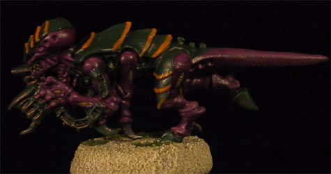
Same as left
image, but with diffusers (paper towels) in place. |
 |
| Moved the bulbs
to 24" from model. This is very close to what it looks
like to the naked eye, although the highlights are still
a little artificially washed out in this picture. |
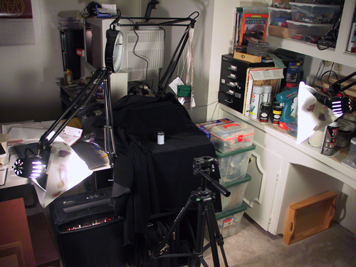 |
| And here's the
exotic, high-tech setup. Two swing arm lights with Chromalux
60W bulbs and paper towel diffusers, positioned to the
right and left, and less than a foot
above horizontal. I use black velvet as a backdrop (a
box underneath creates the back wall) and the mini is positioned
12" from the lens (the mini was on top of that magnet/film
case in the center of the backdrop. |
Speaking of backdrop.
How important is that? Read on...
Backdrop & Lighting
The backdrop of your photographs can have a tremendous impact,
especially if you
have a high tech camera that optimizes light and color. Here
are some pictures of some freshly stripped metal
minis, a comparison between Pine-Sol (left) and Simple Green
(right). This is the sort of picture where light can be your
enemy. In this discussion "bright light" refers to
a primarily direct overhead light (standard incandescent dining
room fixture) and a diffuse light off to the bottom left of the
image (halogen torchiere) at maximum intensity; whereas "dim
light" refers to only the torchiere, reduced significantly
in intensity (inadequate for reading). Now, you
can adjust white balance to change this, but for my purposes,
I would rather set everything up such that the auto settings
work like a charm every time.
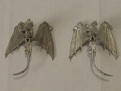 |
| Bright light in room, white office paper as background.
This is pretty close to what it really looked like to the
naked eye. |
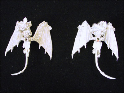 |
| Bright light in room (same as above), black velvet as background |
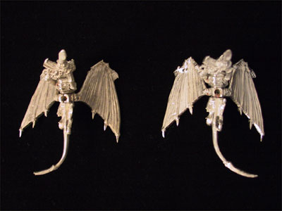 |
| Dim lighting (to the human eye) with black velvet background. |
|